
Name: My Bloody Valentine 3D
Date: 8th January 2009
Director: Patrick Lussier fairly well known director
URL link: http://www.dailymotion.com/video/x81ujz_my-bloody-valentine-2009-trailer_shortfilms
Length: 1:49
Genre & sub genre: Slasher horror movie
Target Audience: 18+ and rated R for the gore in this film is difficult for younger audiences to witness.
Narrative/plot: A miner is going round killing people during the holiday of Valentines Day. No one knows who the killer is and people are trying to save themselves from the miner. He goes after a group of four people, two guys and two girls.
There are a total of six characters:
 |
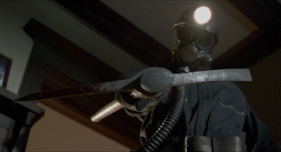
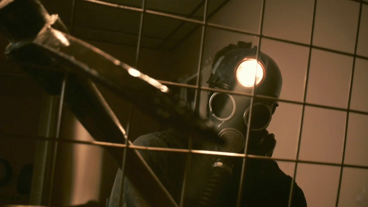
| The Miner |
 |
| Axel Palmer (Kerr Smith) |
 |
| Tom Hanniger (Jensen Ackles) |
 |
| Sarah Palmer (Jamie King) |
| Megan (Megan Boone) |
| Irene (Betsy Rue) |
The miner, Tom Hanniger (Jensen Ackles), Sarah Palmer (Jamie King), Axel Palmer (Kerr Smith), Irene (Betsy Rue), Megan (Megan Boone).
Everyone apart from the miner, are protagonists and each one has a representation of their own. The miner is shown as the ultimate killer but without identity leading the audience to allude who is behind the miner's mask. This presents him as a mysterious and threatening because the audience The representation is created by his actions as he threatens people with a pickaxe and chases him down. This makes him an ulterior villain in the film. Tom Hanniger is shown briefly but only as the hero and makes sense of everything that is going on as well as investigating on who the real killer is. Sarah Palmer and Megan are shown the most and they are presented as weak and frightened as the run away from the miner and try to hide from him instead of defending themselves. They are victims along with Irene. Irene is shown as a naked woman trying to run away and defend herself but she also shows weakness. Axel is shown briefly whilst he is holding a gun out with Sarah behind him and this shows him taking on an active role and being the real hero. Overall there is more visuals on the killer and women and this connotes to the audience that women are the victims. The representation of men and women are unequal for men are presented as heroic and women are victimised.

Medium close ups with just the head and shoulders give us a clear image on the character's emotions, especially when they are scared. Shallow focus is used in order for us to focus specifically on the hand and it informs the audience that a ruthless murder has happened.
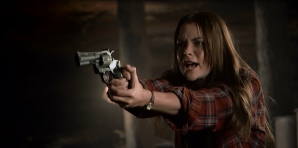
High angle shots are used so the protagonists feel smaller compared to the antagonist and high canted angles are used on him to make him look bigger and more intimidating.
A two shot is used in so characters can engage in the same scene with each other but it also adds a horror element. Sarah Palmer is facing the camera directly yet what she doesn't know is that the miner is standing behind her. Audiences see this and would feel threatened as they know the miner is behind Sarah and she doesn't know making it obvious that her life is in danger.

The pace of the trailer is builds up to a fast pace which helps to intensify the fear within audiences for it makes it difficult for them to piece together the logic of the film and in turn it makes the audiences more intrigued on the plotline of the film and how the many scenes within the trailer all fit to create a flowing plotline. There is no music in the trailer which allows the narrative to be conveyed to the audience clearly and it does not distract the audience. Although there are many sound effects like the sounds of the pickaxe being slashed or thrown, screams and things exploding. The sound effects help the audience to feel threatened and scared but it also helps to convince the audience of the horror as well as making the actions of the film more realistic.
There are two voiceovers in the film - one is of a female who is giving a news report and providing audiences with a few details: "This is the most horrific event, this town has ever seen. Authorities are calling this: The Valentine's Day massacre." Here audiences get three pieces of information:
- It takes place in February as Valentines Day is dated 14 Feb and this is an iconic holiday to celebrate love
- Location is in a town as the report informs audiences that the horror is in a secluded town and this amplifies the horror for there is no one coming to help the doomed town
- It is scary because massacre is a word to describe a number of murders and this shows the audience that there is a murderer around the town
The second voiceover is a deep male voice which persuades audiences to watch the film:
"In the town of Harmony, something un-explainable is happening. This January, prepare to witness the most frightening 3D motion picture event to tear through the screen: My Bloody Valentine 3D. Nothing says date movie like a 3D ride to hell."
The deep voice is rather authoritative and it is male because audiences feel compelled to listen to as it informs the audience the name of the town and what is happening. It also tries to sell the horror by emphasising the 3D and how frightening the film is.
Animation was used when advertising the 3D element in the film. Special effects were used to show the fire and to animate the miner shining his light and tossing his pickaxe at the audience and this would cause the audience to want to go watch the 3D movie for it will help immerse the audience into the film and make them more interested in the film because the 3D helps to make them a part of the film. The company shown is Lionsgate which is known for making films like The Hunger Games quadrilogy, The Saw movies and American Psycho. Lionsgate is its own company and owns various subsidiaries.
The intertile is as followed: THIS JANUARY, PREPARE TO WITNESS THE 3D MOTION PICTURE EVENT: MY BLOODY VALENTINE 3D. These titles try to persuade audiences on the film by being bold and loud. It directly addresses audiences and convinces them to watch the film. The credits in the end provide vital information like the cast, the production crew, director and producer as well as the production company and a website. The trailer does not provide an date for the film but rather says that the film is COMING SOON which causes the audience to wait until they can find out the release date.
Many things were used in order to keep the hype for the film like fade-to-blacks, fade-to-whites, jump cuts and flashes. Fade to blacks are used on order to make the flow of the film easier to watch and it slows the pace of the film so audiences do not anticipate the fast paced moments but to also allow them enough time to process the visuals and information on screen. Fade-to-whites were also used for the same reason yet it also distracts the viewer and making them aware of what is to come. Jumpcuts were used to create a fast pace and build up anticipation yet it also kept the viewer in mystery for it would briefly show one scene and jump to the next thus making the viewer more interested in the film but also giving the viewer a bit of a mystery to solve. Finally flashes were used due to the similar reasons of jumpcuts yet it would distract the viewer even more and obscure the plot from them building up anticipation.
Most of the dialogue is screaming but there are pieces of dialogue like the scene when Sarah Palmer (Jamie King) yells out in the supermarket: "Hello!?" This is a common cliche in horror films as it reminds the audience that there is a killer around the protagonists which foreshadows a possible murder. Audiences would feel threatened and intimidated as well as intrigued by how the protagonist will be. The opening dialogue is: "What did you see down there?" "Something was following us." This makes the audience alert, aware and threatened by an unsee-able threat.
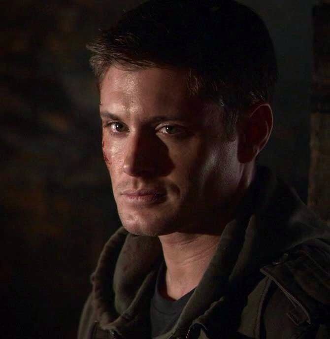 There are three USP's to the film and this is what convinces audiences to go see the film: Slasher, 3D and Jensen Ackles. My Bloody Valentine is a slasher film full of blood and gore which is something that audiences are excited by as it is somewhat normal for audiences to be masochists. The film is in 3D which is a huge sell for it really immerses audiences into the film and it makes them feel as though they are in the film. It makes the film stand out and to really capture the horror of the film. Finally the actor Jensen Ackles, is famous for playing the character Dean Winchester in the TV Show Supernatural. Since Jensen Ackles would have a big fanbase then, it would engage more audiences to see the actor Jensen Ackles in other material i.e. My Bloody Valentine.
The costumes the characters are wearing are modern average clothes like jeans and t-shirts and this allows the audience to understand that the movie is set in a modern time allowing audiences to understand the film. Sets were mostly natural as it gives the horror more realism and it helps to make the narrative convincing for the audience. There is more low key lighting as it immerses the audience into a scary mood as well as providing an element of mystery for it masks the horror from the audience and makes them more interested in the film. Colours that are prominent are reds which has a combined connotation of love and danger. For red to feature constantly in a horror film with a mixture of danger and love draws the audience into the film as well as conveying the narrative rather effectively. A lot of make up would have been used in order to show fake blood and bruises because it is a to ensure the actors performing are safe from danger so having make up of fake bruises will help keep the actors safe from danger as well as portraying pain.
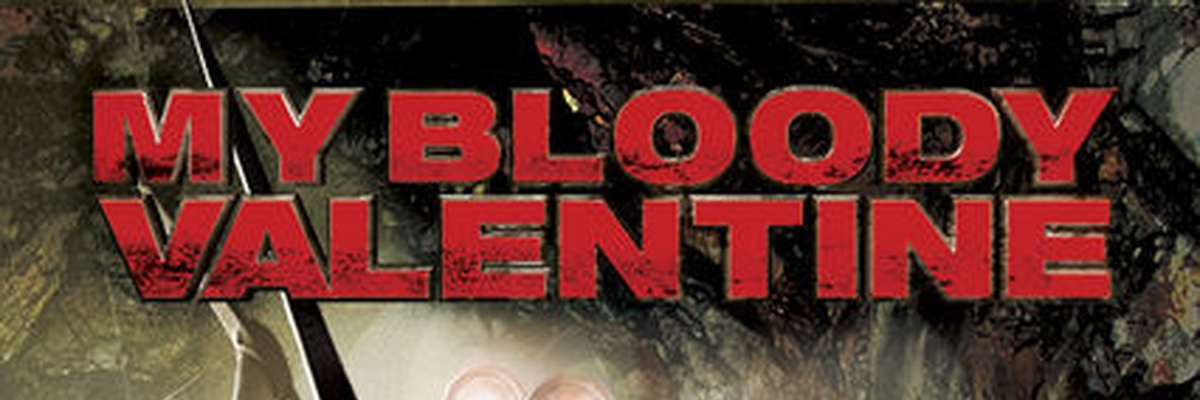
Most of the text is in san serif because it helps to convey the message of the text more effectively but also to look informal as though it is trying to engage with you. The Lionsgate logo is very different as it usually has a white background with white clouds while the font style is monochromatic and a navy colour but the logo in the trailer is slightly dirty and the clouds are coloured a deep red which is similar to blood. This implies to the audience that the trailer they are about to watch is rather scary and quite bloody. It links to the theme of the film once again selling the fact that this is a horror movie trailer.
The other fonts are san serif bold and coloured red with black splodges to signify that the film is a horror slasher film.
The trailer for My Bloody Valentine is very conventional as it uses many factors like jumpcuts, cut off sound, fade-to-blacks, voiceovers, crescendo of sound, 3 part arc. The trailer uses jumpcuts and fade-to-blacks in order to give audiences a brief glimpse into what the film is about as well as mixing up the plot. The crescendo of sound helps to build tension within the scene to which the viewer anticipates and makes audiences thoroughly interested and persuades them into watching the film. Vocieovers are in the trailer in order to provide the audience with a brief exposition of the story. The 3 part arc ensures the trailer has a structure as it follows Todorov's narrative in that there is a little equilibrium in the beginning and then there is a disruption of the equilibrium. Although the trailer does not show the solution, it does show the exciting parts of the trailer which then keeps the viewer interested.
The pickaxe is a slightly tall with a long curved metal blade and this connotes to mining but in the case of this film, it is presented as a weapon and this makes the audience aware of the danger and feel threatened by the miner. There are symbols and hearts which connote to love and Valentines Day and this reminds audiences that the film takes place in the popular holiday which creates irony for the audience because love is thought to be happy and peaceful rather than violent and angry. There is a miner mask which has a small pipe from the mouth attaching to something else. However it connotes to mining, WW2 and in the case of the film, a mask to hide from as it keeps the audience in a mystery.
After looking at this trailer, I found that following the conventions definitely helps to make a very popular trailer because when watching the trailer, it portrayed the narrative very clearly as well as keeping mystery. The trailer definitely showed the genre effectively and constantly persuaded me to go watch the film and so the use of conventions really helps to sell the film audiences.
No comments:
Post a Comment