 |
| James Whale: Frankenstein (1931) |
 |
| Kenneth Branagh: Mary Shelley's Frankenstein (1994) |
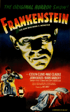
The colours of the poster are contrasting as the 1931 poster uses reds, blues, blacks, greens and yellow. The use of blue in the 1931 poster is to symbolise darkness and melancholy which implies that the film will feature a tragedy which would provoke the audience to feel sympathy. The blue is blurred with the black in order to share the same symbolisation of darkness, depression and evil. Green is tinted with yellow to make a sick like colour and this makes the audience think that the film will be rather sickening and frightful. The background is plain and is consisting of colours which is beneficial because it allows audiences to focus on the main factors of the poster.
The colour of the font is yellow mixed with red and it creates harsh violent colours, symbolising fire which is a part of the films plot and the audience are provided a subtle clue that the film will involve something burning. The red is to signify danger and anger thus conveying the mood that this is a film of violence and sadness.
There is a woman and a man wearing white clothing with contrasting presentations: The woman is wearing white and this makes her a symbol of purity and chastity. Her positioning -the way she is lying shows a contrast suggesting that she has lost that chastity that she is trying to retain; the man wearing white signifies he is intelligent and this is evident in his stance for he is tall and he looks to be mixing something in two glass beakers. The audience conclude he is a scientist and so the man is highly intelligent.
Both posters shares the similarity of having the antagonist/protagonist on the poster as the image. The 1931 'Frankenstein' poster uses the monster as the anchor image because it is the main secondary character of the story: both protagonist and antagonist. Having the monster on the front poster will attract the audience to go watch the film because it is new and interesting. Katz and Blumler will say that the main reason for watching films is for personal identity. Frankenstein's monster being the main image will persuade audiences to go watch the film for interest.
The font of the text is san serif and this is to show the film as artistic and clever. San serif is informal font and it allows audience to feel more attracted to the film because it is bold and big which will catch the attention of the audience. The tagline of the poster is: 'The original horror show! Frankenstein - the man who made a monster". The tagline is to remind audiences of the genre of the film that is horror but also who the true monster of the movie is. The tagline makes the audience believe that there is a person that is more villainous and thus audiences would feel an interest to find out who the true villain of the film is.
The target audience for 1931 Frankenstein would be male and perhaps some female adults aged 18 to 40 because both genders would be interested in science fiction film and the fact that the film was adapted from a nineteenth century novel, it would encourage females to watch how a female authors work is adapted for screen. Male audiences would be fascinated by the science of the film and the poster shows a woman lying down implying that there is a beautiful women thus it relates to the male gaze theory in that men objectify women.
The 1994 poster is dominated by various shades of blue and black with a slight tint of yellow. In the 1994 poster, the blue is a symbol of electricity. The electricity provides the audience a clue to the plot. This poster uses black to shroud the main image as it entices the audience into what the physicality of Frankenstein is and it would persuade audiences to go watch the film to satisfy the mystery.
Most of the background is black which helps to convey mystery and darkness because it keeps the audience on the edge of their seat and inquisitive in order to satisfy the mystery. The background has a cloud effect which gives the audience exposition that the film is set during the night or a setting with bad weather and this is to remind the audience that it is a science fiction movie. The main image is masked by the black colour in order to keep the audience away from the narrative as well as creating mystery so the audience have an interest in the film.
The text is a white serif font with a slight blue glow and this is to make the film come across as an intense scary film. Serif fonts have sharp edges which has the connotations of strength and masculinity and so this would show the audience that the film is serious, scary and intimidating. The poster does not have a tagline and this goes against conventions of a film poster but it would attract audiences to the poster because it is structured differently. This makes audiences rather intrigued by the film poster and thus persuade them to go watch the film.
The target audience for the 1994 Frankenstein would be for males and a small amount of females aged 18 - 30. This film would have a significant male audience because the poster is designed to be very masculine and dominating however females would be interested if they have a preference for mysteries.
No comments:
Post a Comment